 Montreal – When it comes to global warming, there are seven big contributors: the United States, China, Russia, Brazil, India, Germany and the United Kingdom.
A new study published in Environmental Research Letters reveals that these countries were collectively responsible for more than 60 per cent of pre-2005 global warming. Uniquely, it also assigns a temperature change value to each country that reflects its contribution to observed global warming.
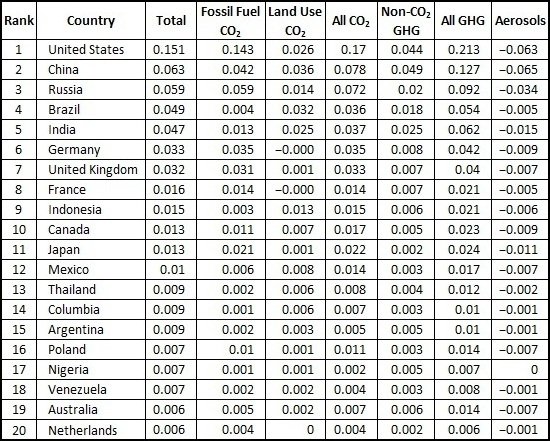
The study was conducted at Concordia University under the leadership of Damon Matthews, an associate professor in the Department of Geography, Planning and Environment. In a straight ranking, the United States is an unambiguous leader, responsible for a global temperature increase of 0.15 C. That’s close to 20 per cent of the observed warming.
China and Russia account for around eight per cent each; Brazil and India seven per cent; and Germany and the U.K. around five per cent each. Canada comes in 10th place, just after France and Indonesia. Although it may seem surprising that less industrialized countries, including Brazil and Indonesia, ranked so highly, their positions reflect carbon dioxide emissions related to deforestation.
In the study, the research team used a new methodology to calculate national contributions to global warming. It weighted each type of emission according to the atmospheric lifetime of the temperature change it caused. Using data from 1750 onward, the team accounted for carbon dioxide contributions from fossil fuel burning and land use change, along with methane, nitrous oxide and sulphate aerosol emissions. (See Table 1)
Table 1. Top 20 Contributors to Global Temperature Change
Ranked is in order of their total climate contribution, and including a breakdown of the contribution of different types of emissions. All values here are given in °C of global temperature change.
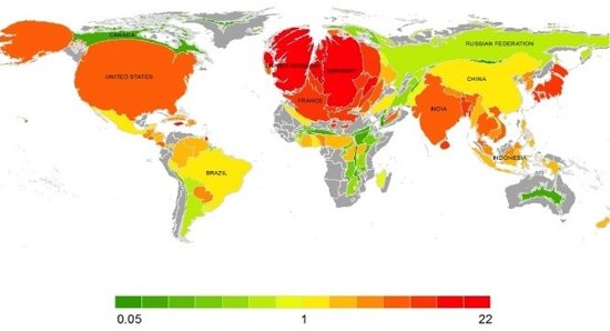
Matthews and his colleagues also experimented with scaling the emissions to the size of the corresponding area. Western Europe, the U.S., Japan and India are hugely expanded, reflecting emissions much greater than would be expected based on their geographic area. Russia, China and Brazil stay the same. Taken in this light, the climate contributions of Brazil and China don’t seem so out of line – they are perfectly in proportion with the countries’ landmasses. Of course, Canada and Australia become stick thin, being countries whose geography is much larger than their share of the global warming pie. (See Figure 1)
Figure 1. Cartogram of National Climate Contributions (Density-Equalized Map) (Gastner and Newman 2004).
Here, the geographic area of each country has been scaled such that the coloured area is proportional to its climate contribution. The colour scale shows the amount by which a country’s size is expanded or contracted relative to its original size (shown in the light-grey background). This, therefore, represents a country’s climate contribution relative to its geographic area, where red indicates countries with very high climate contributions per unit geographic area, and green indicates countries with very small climate contributions per unit area.

